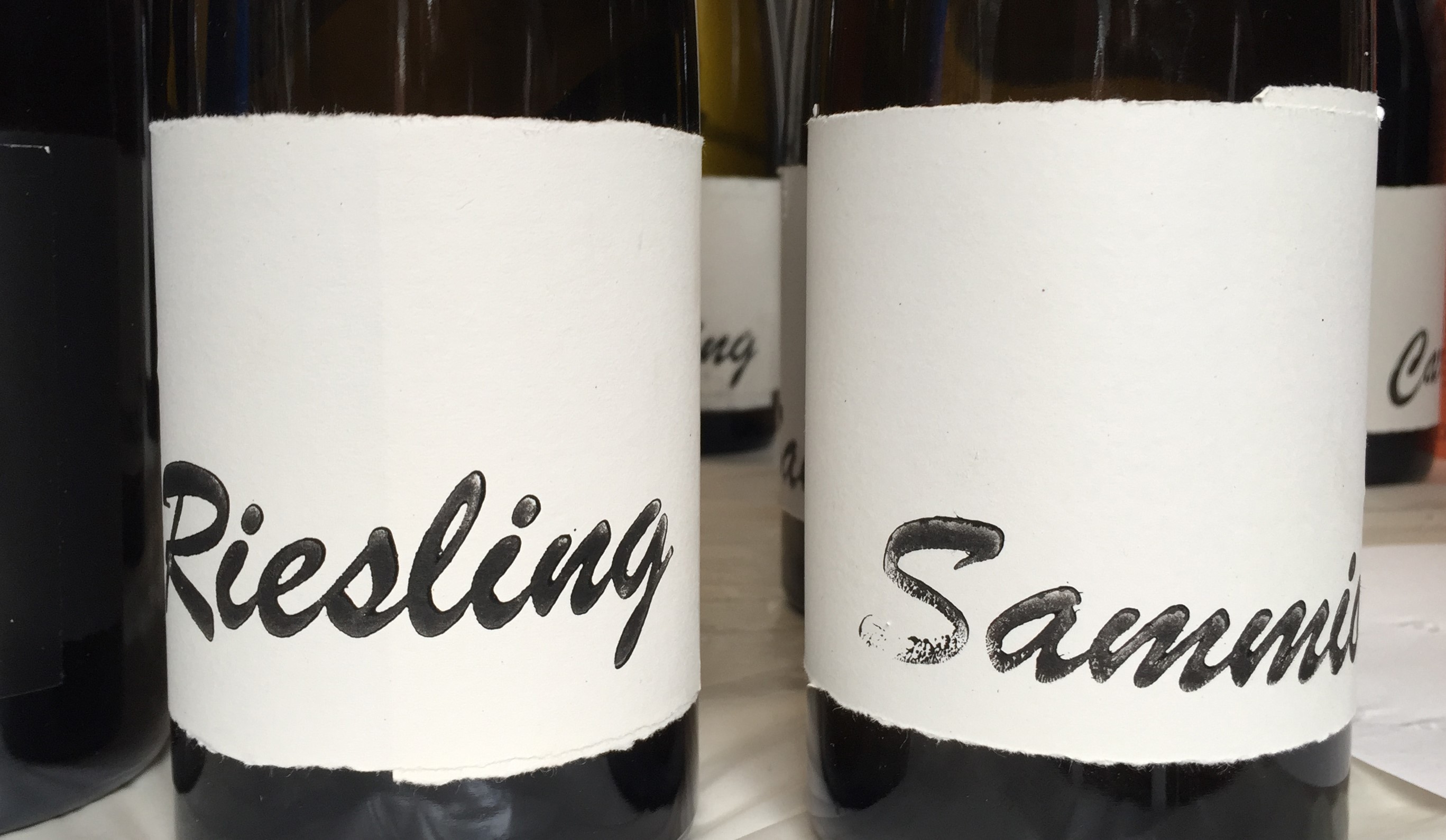
The wine label, a modest piece of paper
By Maria Ferrand
Yes, Paula Silva, I would be honoured to continue your post on ‘The science behind the wine label’. However, I have to admit that your solemn title left me a bit nervous. After all, I am not a scientist, and even as a researcher, I consider myself a novice in academic writing. So I thought it might be appropriate to borrow the words in my title from those of François Guichard in his essay on the language of labels (2000). Although it might sound provocative, it reflects my approach to this topic as both a researcher and a practitioner: wine labels are, indeed, ‘a modest piece of paper’ – yet they hold an enormous communicational and symbolic potential. Acknowledging this paradoxical definition of wine labels implies a two-way posture whose interests may not be incompatible: on the one hand, the ‘humble’ character of wine labels reminds us that wine is undoubtedly the most important thing. On the other hand, the design of wine labels is a crucial aspect of contemporary wine communication. And for wines operating in the global market, it is inescapable. As designers communicate both the tangible and intangible qualities of wines, their work becomes a resource of added-value beyond viticulture and oenology (Branco and Alvelos, 2009; Keers, 2014)

How can that work be best conducted to suit the complex demands of consumption while benefiting the wines and their producers? Fernando Gutiérrez, who designs labels for reputed Spanish vintners, remarks that ‘wine is a very closed world’, where suspicion of design often pairs with the idea that branding is inessential. This viewpoint persists amongst the most complacent winemakers, who champion that wine quality speaks for itself, and therefore is sufficient to ensure its market value (Keers, 2014). Likewise, in Authentic Wine (2011), Goode and Harrop observe that in the wine sector marketing is disconcertingly simplistic and neglected, especially compared to other markets or industries. They also note that New World stakeholders reveal a different attitude from those of the Old World, which usually results in more refined forms of communication.
Goode and Harrop (2011) defend an increasing emphasis on wine quality which ought to be reflected in a more accomplished communication, namely in wine labels. The authors highlight the performance of small wineries, for the effective means by which they value themselves through ‘interesting’ and distinctive stories. Moreover, and regardless of their geographical origin, the best representatives of this tactic often apply it in a sophisticated way without expending substantial financial resources. With my research, which focuses on dry wines of the Douro Demarcated Region (DDR), I attempt to demonstrate that wine labels are powerful design artefacts which extend their commercial purpose beyond a primary (and mandatory) informative function. As they transmit the distinctive identity and cultural heritage of Douro wines with a cost-effective form of innovation and adding value, they may contribute to the craft’s sustainability (Appadurai, 2013; Dilnot and Margolin, 2015). Furthermore, my study aims at bridging the worlds of design and winemaking by opening a new debate within the DDR.

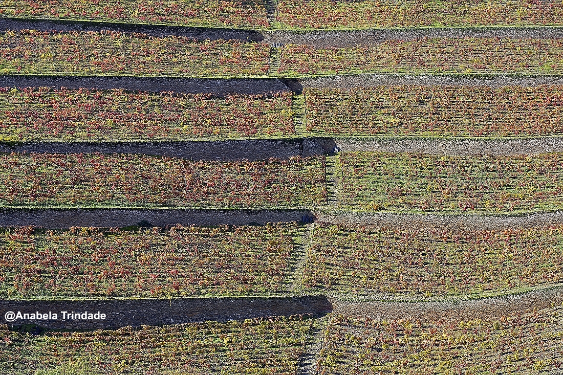
Within this debate, a central question is raised as to why territorial branding ought to be considered a core strategy for the label design of DOC Douro wines. The notion of territorial branding is informed by the concepts of terroir and place of origin (Charters, 2011; 2014). This strategy, the study advocates, might be shared by different stakeholders within the DDR with an advantage for the broader wine craft, in the view of long-term benefits. Making wine in the Douro will never be easy, inexpensive, or plentiful. The DDR’s intricate and interdependent circumstances – characterised by harsh physical conditions, a costly production and low yields, –, as well as the fast and unpredictable changes in worldwide consumption, make it very difficult to extract profit directly from wine production and to compete in the global wine trade (Barreto, 2014). Otherwise, the Douro can also be defined by an ‘excess of identity’. The latter is the result of a long history of viticultural and mercantile tradition, cross-cultural influences, as well as an extensive and outstanding natural and cultural patrimony (Pereira, 2006; Domingues, 2017). Therefore, the conditions of producing and branding wine in the DDR are at the same time problematic, exceptional, and promising.
Responding to this challenging scenario, during the last three decades an impressive development of Douro studies emerged in academia, mainly in the fields of history, social science, anthropology, biotechnology, environmental sciences, geography, viticulture, agrarian technologies and oenology. Likewise, as evidenced in your post, Paula, significant research on the topic of wine labels has been conducted in the fields of management, marketing and economics. Contrastingly, the wine footprint of Portuguese design studies is very low. In Portugal, up to the present date, only three major works of which there is a record address the Douro wine craft from the design’s perspective. The first one, Magda Barata’s The Identity of Port wine through the tradition of its packaging (2009), aims to explain how different historical, technological, regulatory, and commercial aspects of the port wine craft have been transferred into the visual identity of this product. A second design study addressing the Douro wine craft is Helena Lobo’s doctoral thesis, The Visual Identity and Graphic Typology of Port Wine: Wiese & Krohn (1865–2010), published in 2014. This work is an extensive documental analysis of a body of visual ephemera belonging to one single company – Wiese & Krohn.
The third work is a result of the exhibition Images of Port Wine: Labels and Posters, which was held in 2010 at the Douro Museum, in Peso da Régua, and the following year at the University of Porto. Curated by designer Francisco Providência, it displayed a collection of historical labels, packaging and posters. Its principal motivation was to highlight the importance of these artefacts in the history and the construction of port wine’s identity. Simultaneously, an extensive illustrated catalogue was published with essays of design scholars Francisco Providência (on the visual identity of port wine), Helena Barbosa (on port wine posters) and Magda Barata (on port wine labels). Although it has proved extremely useful, this scarce academic production is an intriguing finding, especially considering the growing professional engagement of designers in the craft. Furthermore, the fact that all three works refer to port wine and historical ephemera opens a research gap in respect to Douro’s dry wines, on the one side, and to a more contemporary communication, on the other. My inquiry, therefore, is motivated by a critique of the status quo and develops into a proposition of positive change. Rather than focusing on a particular feature (e.g. typeface, logo, colour, format, an illustration, etc.), the research’s primary concern is the underlying message in wine labels – within a holistic approach to the identity and differentiation of DOC Douro wines.
The study’s discussion, informed by state-of-the-art design practices is not conducted by the process of the scientific method (hence my reluctance in addressing the ‘science’ behind the wine label). Instead, it is framed within a particular approach coined by Nigel Cross as ‘Designerly’ ways of knowing (2001). This framework builds on what the scholar considers to be a sound knowledge that is specific to design thinking, design acting and designers’ own understanding of artefacts. The ‘designerly’ knowledge is thus gained from both design practice and the distinguishing culture of the discipline. The study might ask what would then make a ‘good’ wine label. As a work involving a great degree of subjectivity, empathy and aesthetic fluctuations, there are no absolute certainties in design. But there are principles and directions that ought to be considered (Cross, 2001). In this sense, a ‘good’ wine label design should:
1. Display with clarity what the consumer wants to know;
2. Display what the consumer might not want to know yet is mandatory information;
3. Present the contents of points 1 and 2 with rigour, as well as with formal and conceptual coherence;
4. Use adequate and good-quality materials and resources;
5. Incorporate visual signs of semantic and aesthetic value, which respect the product and its context;
6. Disclose an overall outcome that goes beyond expectation.
Accomplishing all these requirements with eloquence is the ultimate challenge of every wine label assignment. Designer Chuck House (2003) argues that both the processes of making wine and designing labels follow certain recurrent patterns, but the way in which each one deviates from that pattern, offers the clue to its distinctive identity. House adds that due to the growing complexity and refinement of print production, designing wine labels today may also require exceptional technical expertise. Finally, Guichard (2000) recognises that the design process or the transformation of concepts and regulations into a limited, yet accomplished surface demands laconic, ingenious and sophisticated work.
Can all of this be achieved in a modest piece of paper?
Maria Ferrand is a communication designer who is currently conducting her PhD at the University of Edinburgh. Her research focuses on the label design of DOC Douro wines, and the ‘designerly’ use of the concept of territorial branding.

A design lecturer for more than 20 years, with an MA degree in Multimedia Arts, she has taught in the fields of graphic design, typography and illustration. As an author and a practitioner, she has worked across multimedia design, visual identity, editorial design, and illustration. Attempting to escape from her comfort zone, Maria entered the wine world by a rather convoluted route, completely diverging from both her professional and academic path. Yet given her growing passion for the wines and their image, she might be around for a while.
- Guichard, F. (2000) Le dit et le non-dit du vin: le langage des etiquettes, Annales de Géographie, 614–615: 364–380
- Branco, V. and Alvelos, H. (2009) Strategies Towards the Enhancement of the Symbolic Value of Portuguese Artifacts. 8th European Academy of Design Conference, April 2009, The Robert Gordon University, Aberdeen, Scotland.
- Keers, P. (2014) Process and Poetry. Eye Magazine Food Special Issue no. 87 vol. 22: 87-95
- Goode, J. and Harrop, S. (2011) Authentic wine: Toward Natural and Sustainable Winemaking. Los Angeles, California, University of California Press
- Appadurai, A. (1986) Introduction: Commodities and the politics of value. In: Appadurai, A. Ed. The Social Life of Things: Commodities in Cultural Perspective. Cambridge, Cambridge University Press, 3-63
- Dilnot, C. and Margolin, V. (2015) Introduction to the scientific production (2002-2011): contributions to the formation of the Interpretation Centre for Portuguese Design (CIDES.PT). Precedents: Genealogy of Design’s Museology at the University of Aveiro. Aveiro, UA Editora, ID+
- Charters, S. et. al (2011) The Territorial Brand in Wine. 6th AWBR International Conference, Bordeaux Management School.Charters
- Charters, S. and Michaux, V. (2014) Strategies for wine territories and clusters: why focus on territorial governance and territorial branding?, Journal of Wine Research, 25:1, 1-4
- Barreto, A. (2014) Douro – Rio, Gente e Vinho. Lisboa, Relógio d’Água Editores
- Pereira, G. (2006) A Evolução Histórica. In: Soeiro, T. et. al (2006) Viver e saber fazer – Tecnologias tradicionais na região do Douro. Peso da Régua, Fundação Museu do Douro.
- Domingues, A. (2017) Volta a Portugal. Contraponto Editora
- Barata, M. (2009) Identidade do Vinho do Porto, pela Tradição da sua Embalagem. MA Thesis, Aveiro University, DCA.
- Lobo, H. (2014) Identidade Visual e Tipologia Gráfica do Vinho do Porto: Wiese & Krohn (1865-2010). PhD thesis, Universitat Politècnica de València.
- Providência, F., Barbosa, H. and Barata, M. [coord.] (2010) Imagens do Vinho do Porto: rótulos e cartazes. Images of Port Wine: labels and posters. Peso da Régua: Fundação Museu do Douro
- Cross, N. (2001). Designerly ways of knowing: design discipline versus design science. Design Issues, 17(3): 49–55
- Caldewey, J. And House, C. (2003) Icon – Art of the Wine Label. San Francisco, Wine Appreciation Guild

