
By Gregory V. Jones
The question is “what is normal”? Like many meteorologists and climate scientists, I get asked this question all the time. We typically make statements that describe a certain day, or month, or event, as warmer, colder, more extreme, etc. than average or normal. This is because observing and discussing climate is inherently statistical and requires comparison to baseline periods to make sense of how they relate to our lives. By saying goodbye to 2020 – I think we can all agree it’s more aptly good riddance – we are moving from one decade into another and ushering in a new climate baseline period and new statistics to report from. So, with new climate normal period data being released in many countries worldwide, and the USA last month, I thought it would be worth sharing a little about this process and what it means as we start discussing the “new normal”.
Climate normal periods are based on 30 years of data to limit the random swings of daily weather. These standard reference periods are recommended by the World Meteorological Organization (WMO) in order to better reflect the changing climate and its influence on our day-to-day weather experience. The WMO requires each member nation to compute these climate normal periods and even pledges support to help members update their data.
Many countries and climate agencies have already switched to the new baseline period of 1990-2020. For example, in the United States, the National Oceanic and Atmospheric Administration (NOAA) updates the normals every ten years for the country as a whole, for every single state and territory, and for many cities (739 major weather stations). These 30 year normals are established on an annual, seasonal, monthly, and daily basis. It is from these normals that we make statements about how any one period or event deviates from average or normal.
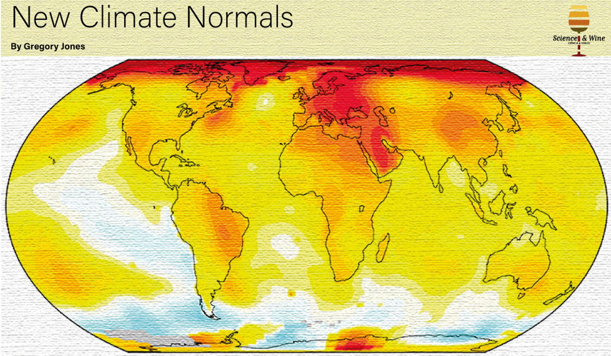
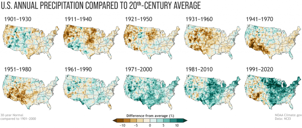
Once 2020 was over, it took NOAA a surprisingly short time to get the new 1991-2020 climate normals data released. These new normals point to a significantly warmer United States with nearly 95% of all stations showing increases in temperatures (Figure 1). As a country, we are 0.3°C warmer in the 1991-2020 normals compared to the 1981-2010 normals, albeit many locations saw temperatures warm by over 0.9°C. The country also saw changes in precipitation (Figure 2) with the eastern and central portions of the US getting wetter (increasing 10% or more) while areas in the western US became drier (dropping 10% or more).

Once the new 1991-2020 climate normals are available across all platforms and countries I will start using them in my reports and presentations. However, I must admit as a climate scientist I am concerned about how useful or potentially misleading the newly calculated normals will be for the public in terms of understanding climate change. And many of my colleagues are split on this as well. We see many very useful outcomes with the updated data, such as city and regional planners being able to establish current criteria for floods and drought, farmers and gardeners deciding what and when to plant, medical personnel managing public health issues, and energy companies establishing demand, all based upon our new normals. However, others are concerned that the 1991-2020 normals were so warm that if the coming days, weeks, months, or years are not warmer than those in the new normals period, then the public will think that climate change is not happening. Or in other words, by using the new normals we may be normalizing away climate change.
For example, the Copernicus Climate Change Service monitors global climate characteristics and recently noted that they will start using the 1991-2020 climate normals as the main reference for global climate bulletins and their European State of Climate for 2021. The agency reported that the change in reference period does not affect any trend calculations or absolute rankings of months or years … 2016 and 2020 are still tied for the warmest years on record, until another year bests the record. However, the switch to the new reference period does impact statements about whether a month or year is above or below average. The agency reported that, for example, globally January 2021 was 0.24°C above the 1991-2020 reference period, but 0.43°C above the 1981-2010 period. While this example may not seem like much, it is a smaller number which will likely lead to some apathy in terms of understanding the magnitude of our changing climate.
Many climate agencies also caution on using differences between two climate normal periods as evidence for trends. This is because any two climate normal periods overlap by two decades, so any differences are due to those from the first decade in the first period and the third decade in the second period (comparing 1981-2010 and 1991-2020). While the differences very well could be due to the climate warming, they could also be due to variations in large-scale climate driving mechanisms such as El Niño and La Niña or even changes in the observing system.
Therefore, while I and other climate scientists will use the 1991-2020 normals when available, I recommend that we should also continue to reference previous normal periods such as 1981-2010 or even the entire period of record for a given climate station to depict how ‘normal’ or not conditions are and truly represent how far things have changed.
For more information visit public.wmo.int, climate.gov, climate.copernicus.eu, or:
World Meteorological Organization (2017). WMO Guidelines on the Calculation of Climate Normals, WMO-No. 1203, 978-92-63-11203-3
Gregory V. Jones, Ph.D.
Director, Evenstad Center for Wine Education
Evenstad Chair, Wine Studies
Professor, Department of Environmental Studies
Linfield University
McMinnville, Oregon, USA
gjones@linfield.edu
Education
Ph.D. and B.A. – Environmental Sciences (concentration in Climatology), University of Virginia, Charlottesville, VA, September 1991 to September 1997. Ph.D. awarded January 1998. Dissertation: Synoptic Climatological Assessment of Viticultural Phenology (Dr. Robert E. Davis, Advisor).
Teaching:
Professor, Southern Oregon University, Ashland, OR – Physical Geography, Weather and Climate, Climatology, Research Methods, Quantitative Methods for Geographers, Global Change Issues, Geography of Latin America, Map Analysis, Cartography, Geographic Information Systems. 1997-present.
Professor, Linfield University, McMinnville, OR – Viticulture, Wine Production, Wine Business, Terroir, Sensory Evaluation. 2018-present.
General Biography
Gregory V. Jones is the Director of the Evenstad Center for Wine Education, holds the Evenstad Chair in Wine Studies, and is a professor and research climatologist in the Department of Environmental Studies at Linfield University. He specializes in the study of climate structure and suitability for viticulture, and how climate variability and change influence grapevine growth, wine production and quality. He conducts applied research for the grape and wine industry in Oregon and many regions worldwide and has given hundreds of international, national, and regional presentations on climate and wine-related research. He is the author of numerous book chapters and other reports and articles on wine economics, grapevine phenology, site assessment methods for viticulture, climatological assessments of viticultural potential, and climate variability and change impacts on wine production. He was named to Decanter Magazine’s 2009 Power List representing the top 50 most influential people in the world of wine, named the Oregon Wine Press’s 2009 Wine Person of the Year, has been named in the Top 50 Wine Industry Leaders in Wine Business Monthly in 2016, 2017, and 2018, and has been in the top 100 most influential people in the US wine industry in 2012, 2013, and 2018 (intowine.com). Recently he was named Honorary Confrade with the Rank of Infanção (Nobleman) from the Confraria do Vinho do Porto and installed as a knight in the Oregon Wine Brotherhood.
Publications
For a complete list of publications and videos see https://www.linfield.edu/wine/greg-jones.html
[…] Science & Wine: New Climate Normals […]